

EAT WHOLY - REFRESH
Refreshing Wholy’s identity with vibrant design, strong messaging, and a unified presence.
Wholy is a clean-label snack brand blending feel-good indulgence with wholesome, minimal ingredients. A year after launch, with new products on the horizon and a clearer brand vision, Wholy returned with a new ask: to refresh its packaging and evolve its tone of voice across all touchpoints. The challenge was to build on the existing identity, enhancing the visual and verbal language without losing the brand’s core simplicity and honesty. I worked on the redesign of their latest product packaging and developed updated brand and social guidelines to create a more vibrant, cohesive presence across platforms.
Context & challenge
PROJECT SCOPE
Packaging Redesign, Rebranding, Strategy, Positioning
INDUSTRY
Food & Beverage
Creative work delivered independently for Vita Foods in 2024.
Context & Challenge
Wholy is a clean-label snack brand blending feel-good indulgence with wholesome, minimal ingredients. A year after launch, with new products on the horizon and a clearer brand vision, Wholy returned with a new ask: to refresh its packaging and evolve its tone of voice across all touchpoints.
The challenge was to build on the existing identity, enhancing the visual and verbal language without losing the brand’s core simplicity and honesty. I worked on the redesign of their latest product packaging and developed updated brand and social guidelines to create a more vibrant, cohesive presence across platforms.
The creative goal: To unify new product packaging under a fresh, flexible system and bring more personality to the brand’s tone of voice.
PROJECT SCOPE
Packaging Redesign, Rebranding
Strategy, Positioning
INDUSTRY
Food & Beverage
Creative work delivered independently for Vita Foods in 2024.
EAT WHOLY - REFRESH
Refreshing Wholy’s identity with vibrant design, strong messaging, and a unified presence.

Strategy & Insights
The strategy was to clean up the layouts while adding visual punch through vibrant, contrasting colors that instantly signal flavor and variety.
A sharper hierarchy of information made it easier for shoppers to spot key claims, while bold photography brought indulgence to the forefront. Each product line was given its own distinct, flavor-led personality, yet unified under a cohesive system, ensuring Wholy stood out as both trustworthy and fun. By blending minimal structure with expressive details, the new design direction intended to be easier to navigate and visually tempting.


The Fudgy Cakes identity was designed to visually capture the richness and indulgence of the product. The logo takes on a soft, gooey style, while wave elements echo the dense, textured layers of fudge. The product photography pushed this further, with fillings intentionally styled to drip into the layout, creating a dynamic, crave-worthy look.
Alongside these expressive touches, Wholy’s brand elements were used as a unifying element, ensuring the line stood out as bold and tempting, while still part of a larger, cohesive brand system.
The Fudgy Cakes identity was designed to visually capture the richness and indulgence of the product. The logo takes on a soft, gooey style, while wave elements echo the dense, textured layers of fudge. The product photography pushed this further, with fillings intentionally styled to drip into the layout, creating a dynamic, crave-worthy look. Alongside these expressive touches, Wholy’s brand elements were used as a unifying element, ensuring the line stood out as bold and tempting, while still part of a larger, cohesive brand system.
Strategy & Insights
The strategy was to clean up the layouts while adding visual punch through vibrant, contrasting colors that instantly signal flavor and variety. A sharper hierarchy of information made it easier for shoppers to spot key claims, while bold photography brought indulgence to the forefront. Each product line was given its own distinct, flavor-led personality, yet unified under a cohesive system, ensuring Wholy stood out as both trustworthy and fun. By blending minimal structure with expressive details, the new design direction intended to be easier to navigate and visually tempting.


SETTING THE TONE
A comprehensive brand guideline was created to ensure Wholy’s identity remained consistent and recognizable across every platform. It detailed tone of voice, messaging style, and visual hierarchy, while also outlining packaging layout systems and social media dos and don’ts. The guidelines extended to web and digital touchpoints as well, giving clear direction on how the brand should look, sound, and behave. By putting these systems in place, I set up a cohesive framework that allowed anyone working on the brand to carry its vibrant personality forward with clarity and consistency.


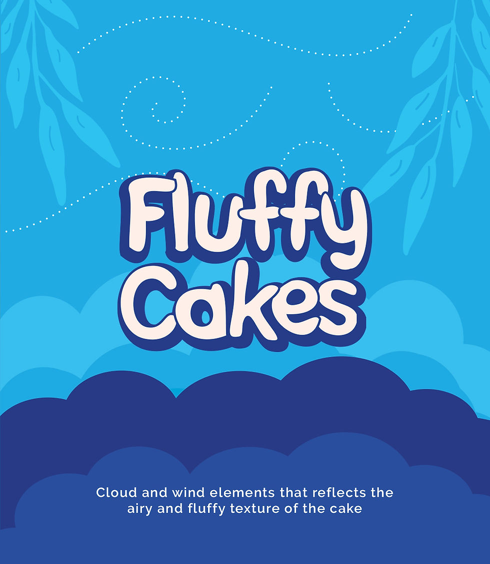
The Fluffy Cakes identity was designed to visually capture the lightness and airy texture of the product. The logo uses rounded, cloud-like edges, while soft cloud and wind elements echo the pillowy feel of the cake. The product photography pushed this further, with cakes styled to appear floating,Unlike the darker, indulgent tones of Fudgy Cakes, this line introduced a lighter color palette with contrasting accents, ensuring the visuals felt airy and approachable,
while still part of a larger, cohesive brand system.
The Fluffy Cakes identity was designed to visually capture the lightness and airy texture of the product. The logo uses rounded, cloud-like edges, while soft cloud and wind elements echo the pillowy feel of the cake. The product photography pushed this further, with cakes styled to appear floating,Unlike the darker, indulgent tones of Fudgy Cakes, this line introduced a lighter color palette with contrasting accents, ensuring the visuals felt airy and approachable, while still part of a larger, cohesive brand system.


SETTING THE TONE
A comprehensive brand guideline was created to ensure Wholy’s identity remained consistent and recognizable across every platform.
It detailed tone of voice, messaging style, and visual hierarchy, while also outlining packaging layout systems and social media dos and don’ts. The guidelines extended to web and digital touchpoints as well, giving clear direction on how the brand should look, sound, and behave. By putting these systems in place, I set up a cohesive framework that allowed anyone working on the brand to carry its vibrant personality forward with clarity and consistency.


ACROSS EVERY PLATFORM
To build a lasting impression, Wholy’s identity needed to extend beyond the packaging, into every moment a consumer might interact with the brand. From point-of-sale units to supermarket banners, posters, and social media campaigns, the same visual and tonal language carried through: bold color, warm humor, clean messaging, and hand-drawn elements. Every touchpoint was intentional, making Wholy instantly recognizable across all platforms and placements.

Designed to Last
The brand refresh gave Wholy the tools to evolve with its expanding lineup while keeping its identity intact. A clear system of packaging, tone, and guidelines ensures cohesion across every channel, while bold visuals and approachable messaging keep the brand exciting and relevant. This new direction not only strengthens Wholy’s presence in the market but also sets the stage for long-term growth.

