
EAT WHOLY - LAUNCH
Blending clarity, character, and consistency for a brand that redefines healthy snacking.
Wholy is a clean-label snack brand in India, rooted in simplicity, serving up wholesome, feel-good treats made from clean, minimal ingredients. Designed for all ages, it blends indulgence with intention, creating snacks that feel as good as they taste. In a market crowded with over-designed health snacks and artificial energy claims, Wholy needed a packaging system that could spark attention without being too loud. The challenge was to build a design language that felt joyful, trustworthy, and shelf-ready—something that could stand out with quiet confidence, yet still bring the fun.
Context & challenge
PROJECT SCOPE
Packaging Design, Marketing Collaterals, Brand Building, Visual Identity.
INDUSTRY
Food & Beverage
Creative work delivered independently for Vita Foods in 2020.
Context & Challenge
Wholy is a clean-label snack brand in India, rooted in simplicity, serving up wholesome, feel-good treats made from clean, minimal ingredients. Designed for all ages, it blends indulgence with intention, creating snacks that feel as good as they taste.
In a market crowded with over-designed health snacks and artificial energy claims, Wholy needed a packaging system that could spark attention without being too loud. The challenge was to build a design language that felt joyful, trustworthy, and shelf-ready—something that could stand out with quiet confidence, yet still bring the fun.
The creative goal: Design packaging that feels bold yet approachable.Visually the aim was to make healthy feel exciting and snack-able, with a cohesive identity as wholesome as what’s inside.
PROJECT SCOPE
Packaging Design, Marketing Collaterals, Brand Building,
Visual Identity
INDUSTRY
Food & Beverage
Creative work delivered independently for Vita Foods in 2020.
EAT WHOLY
Blending clarity, character, and consistency for a brand that redefines healthy snacking.


Strategy & Insights
With the health snack aisle saturated by either overly clinical or excessively loud designs, there was a clear opportunity to carve out space for something more joyful and honest. Wholy needed to feel fresh—balancing clean, trustworthy design with an expressive, modern edge. By studying brands like RXBAR, KIND, and BTR Nation, it became clear that bold color blocking, minimal layouts, and flavor-forward visuals build trust and visibility. This informed a design direction that celebrates both form and function: a visual identity that’s easy to spot, easy to trust, and exciting to pick up—just like the snacks themselves.
Strategy & Insights
With the health snack aisle saturated by either overly clinical or excessively loud designs, there was a clear opportunity to carve out space for something more joyful and honest. Wholy needed to feel fresh—balancing clean, trustworthy design with an expressive, modern edge.
By studying brands like RXBAR, KIND, and BTR Nation, it became clear that bold color blocking, minimal layouts, and flavor-forward visuals build trust and visibility. This informed a design direction that celebrates both form and function: a visual identity that’s easy to spot, easy to trust, and exciting to pick up, just like the snacks themselves.
APPROACH
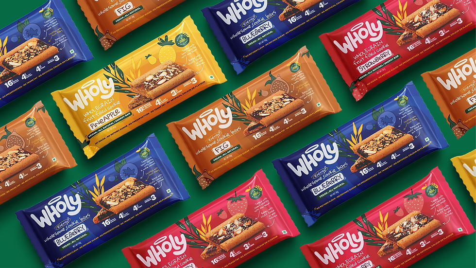
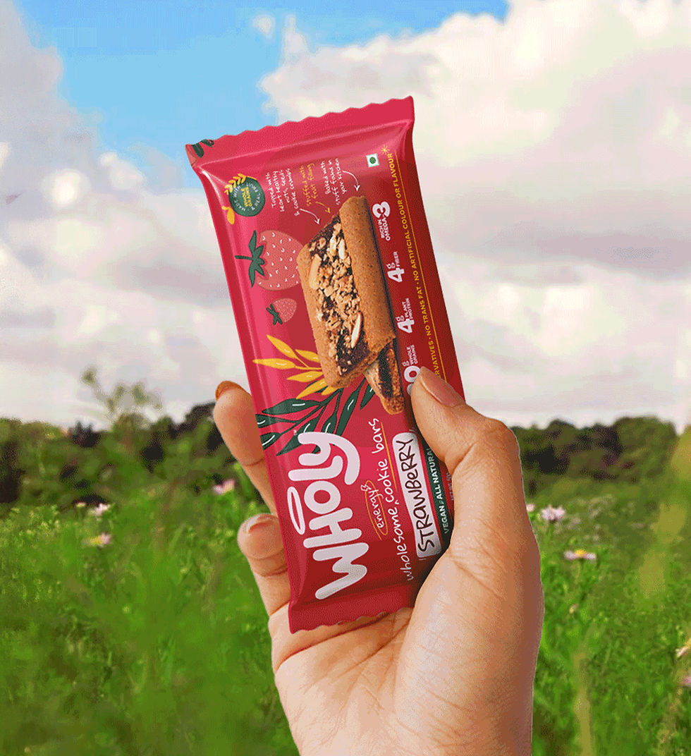
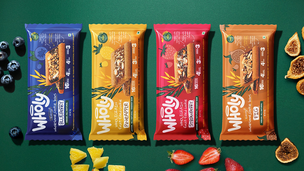
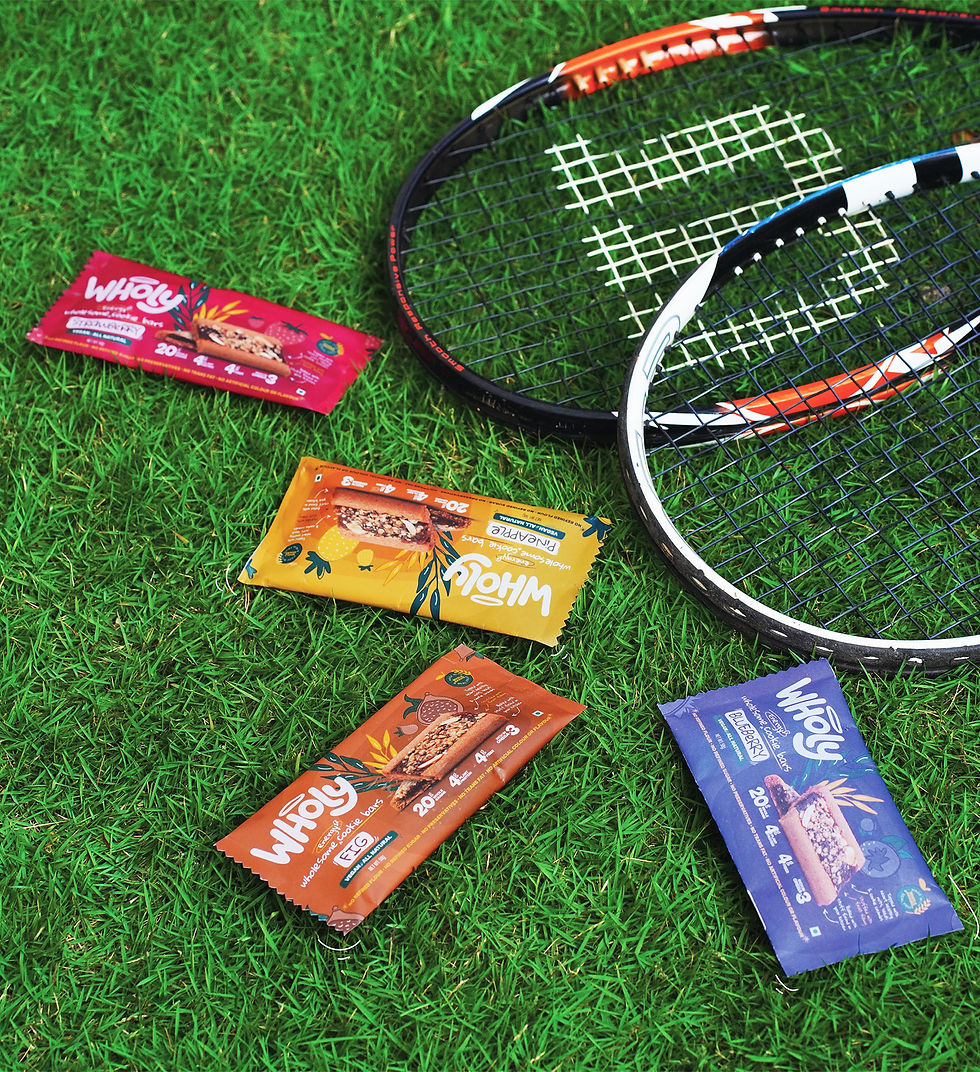
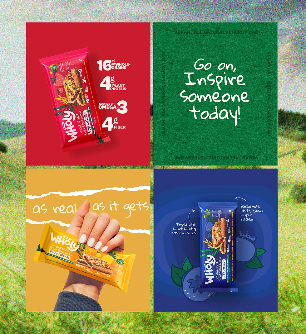
The design system was rooted in consistency, flavor differentiation, and visual appeal. Using strong, singular color backgrounds paired with illustrative flavor cues, the packs were able to stand out while remaining cohesive as a line. The central cookie image anchors the composition, with supporting graphics and benefit callouts neatly placed around it.
The result: a flexible packaging structure that elevates Wholy’s ingredient-first message.
APPROACH
The design system was rooted in consistency, flavor differentiation, and visual appeal. Using strong, singular color backgrounds paired with illustrative flavor cues, the packs were able to stand out while remaining cohesive as a line. The central cookie image anchors the composition, with supporting graphics and benefit callouts neatly placed around it. The result: a flexible packaging structure that elevates Wholy’s ingredient-first message.


A significant aspect of the initial brand launch designs focused on creating distinctive point-of-sale materials that were both engaging and memorable. This included thoughtfully designed collaterals, strategic product placements, and additional brand collaterals that adds to the brand experience.


UNBOX THE BRAND
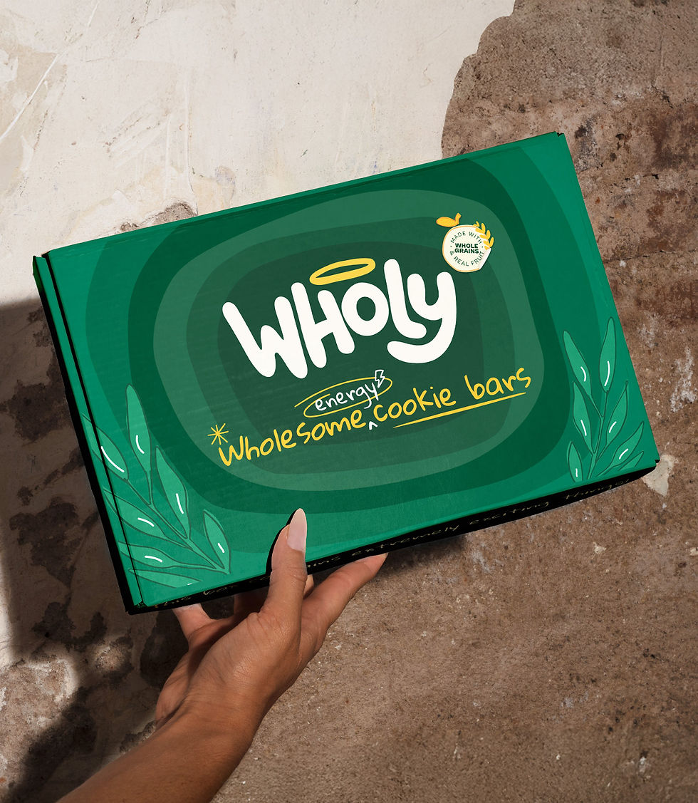
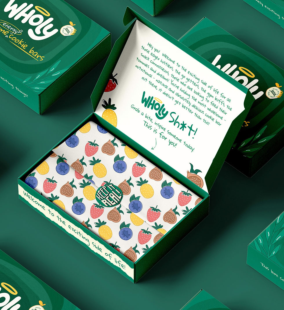
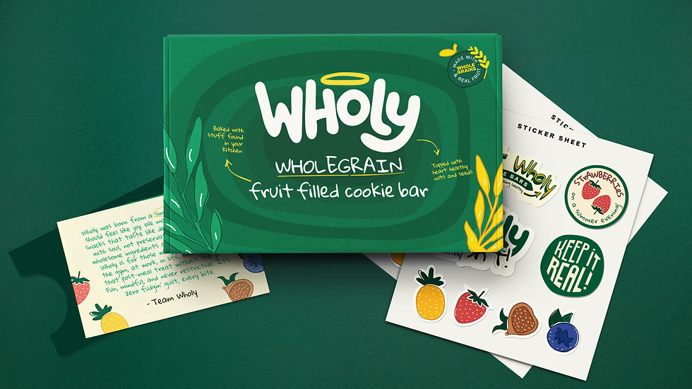
To elevate first impressions of this new brand, I crafted an unboxing experience that blended joy and storytelling. Every element, from the bold outer packaging to the illustrated stickers and handwritten note, was intentionally designed to feel thoughtful and human. The goal was to make customers feel like they were receiving more than just a product; they were stepping into a brand world that was playful, uplifting, and worth remembering.
Unbox the Brand
To elevate first impressions of this new brand, I crafted an unboxing experience that blended joy and storytelling. Every element, from the bold outer packaging to the illustrated stickers and handwritten note, was intentionally designed to feel thoughtful and human. The goal was to make customers feel like they were receiving more than just a product; they were stepping into a brand world that was playful, uplifting, and worth remembering.


ACROSS EVERY PLATFORM
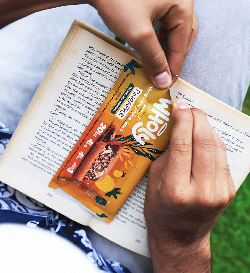
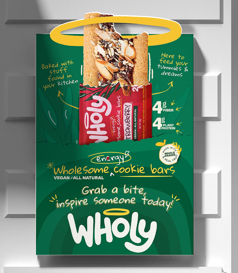
To build a lasting impression, Wholy’s identity needed to extend beyond the packaging, into every moment a consumer might interact with the brand. From point-of-sale units to supermarket banners, posters, and social media campaigns, the same visual and tonal language carried through: bold color, warm humor, clean messaging, and hand-drawn elements. Every touchpoint was intentional, making Wholy instantly recognizable across all platforms and placements.
Across Every PLATFORM
To build a lasting impression, Wholy’s identity needed to extend beyond the packaging, into every moment a consumer might interact with the brand. From point-of-sale units to supermarket banners, posters, and social media campaigns, the same visual and tonal language carried through: bold color, warm humor, clean messaging, and hand-drawn elements. Every touchpoint was intentional, making Wholy instantly recognizable across all platforms and placements.


To ensure brand consistency beyond launch, I developed master creatives for both digital and print. These assets were designed to be easily adapted, giving future teams or agencies a clear, cohesive foundation to build on.


Laying the Foundation
The Wholy brand launched with clarity, confidence, and a vibrant personality that stood out on every shelf and screen. From packaging to point-of-sale to digital touchpoints, every element reinforced a fun-yet-credible identity rooted in simplicity and joy. The design system not only captured attention, it also laid the foundation for a brand experience that feels fresh, snackable, and here to stay.

