

Money Trees is a bold reimagining of what a plant shop can be, where urban edge meets botanical charm. With bold energy and a love for community, they set out to redefine what a modern plant shop is. The challenge was to create a visual identity that could carry this attitude, something modern, cheeky, and vibrant while still feeling like a credible, cohesive brand. The creative direction needed to feel fresh, energetic, and unmistakably urban, while still working across different brand touchpoints -from storefronts to social.
Context & challenge
PROJECT SCOPE
Logo Design, Visual Identity, Brand Collaterals.
INDUSTRY
Lifestyle & Wellness
Developed as part of my role at Modish Creative, in 2023.
Lead content strategy, design, and identity development.


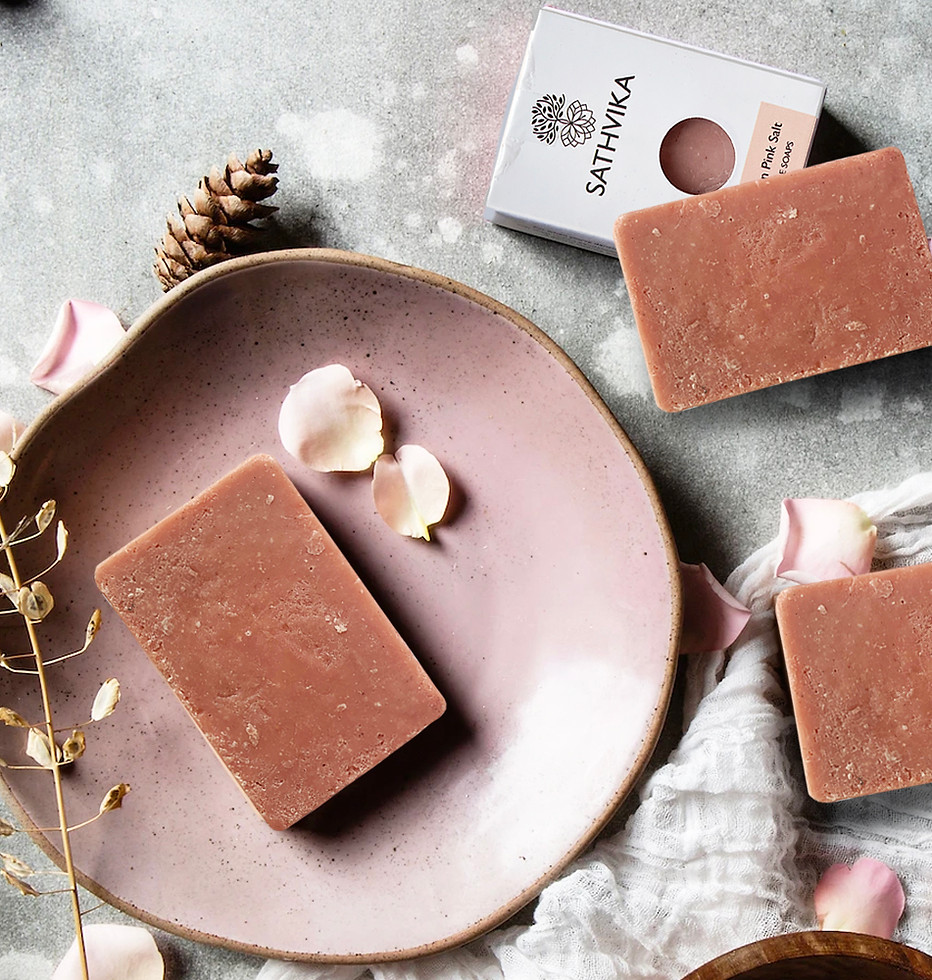
The packaging design embodies the brand's core philosophy, clean, natural, and rooted in simplicity. For all their product category a cohesive visual system was developed, where each product shares a unified layout, While the concept for the oil category remained the same, the illustrated elements shift to reflect the unique ingredients


Sathvika Skincare is a clean, organic beauty brand rooted in the wisdom of traditional Indian Ayurvedic practices. Every product is thoughtfully crafted with natural, plant-based ingredients to nurture and enhance the skin's natural radiance without compromise.
Strategy & Insights
The name Sathvika, derived from Sanskrit, meaning "pure" and "natural," became the guiding inspiration behind the brand identity and visual language. The brand's color palette, earthy greens and rich browns, evokes a grounded, nature-first ethos, while the logo merges the tree of life and lotus flower, symbolizing purity, vitality, and the healing power of nature. Together, these elements reflect the core philosophy of Sathvika: beauty that is rooted in nature and elevated by tradition.


The social media presence carried the same clean, nature-inspired aesthetic as the brand itself. Subtle brand elements and earthy tones framed each post, allowing the products to take center stage. For the launch, we introduced a striking three-post grid campaign, designed to captivate online audiences and showcase the product line in a bold, cohesive way.


PURITY MEETS PURPOSE
Sathvika’s rebrand brought its core values of natural purity and traditional care into a modern, intentional design system. From a logo inspired by the tree of life and lotus flower to packaging that blends minimal structure with earthy warmth, every detail reflects the brand’s grounded ethos. Its social media presence carries the same clean, nature-inspired aesthetic, creating a cohesive visual language that feels authentic, rooted in tradition, and ready to connect with today’s conscious consumer.

