

Context & Challenge
Ounce Bakery is a boutique bakery in India, aiming to modernize its identity and digital presence.The project focused on giving the brand a fresh, contemporary twist while elevating its social media and design systems. The goal was to create a look that felt refined and sophisticated enough to stand out, while still warm and inviting to its community.
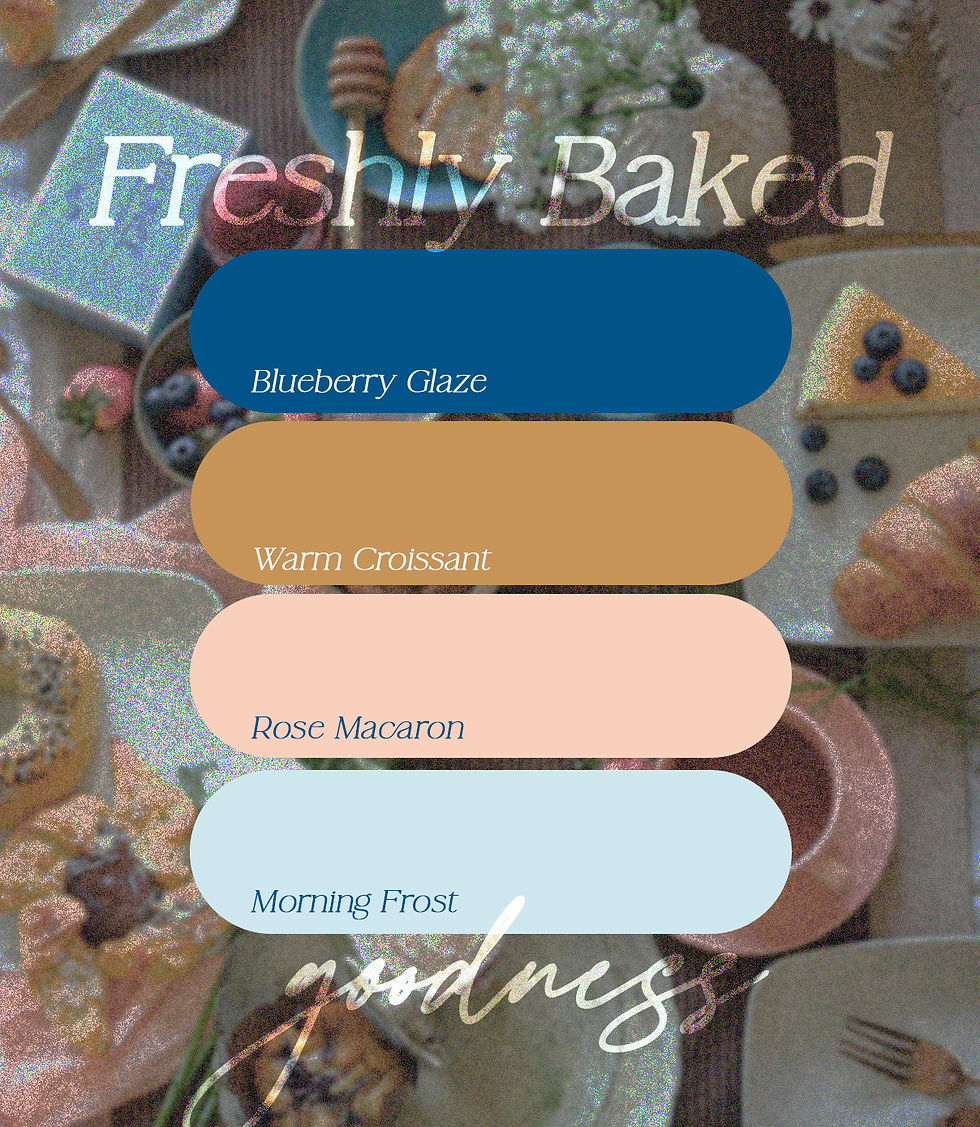
Through a cohesive color palette and typography system, the visual direction leaned into elegance while ensuring memorability in a competitive market. From packaging to social media to in-store experiences, the designs deliver a consistent aesthetic that feels polished, artisanal, and true to Ounce’s spirit.
PROJECT SCOPE
Brand Collaterals, Environmental Graphics, Social Media Design
INDUSTRY
Food & Beverage
Creative work delivered independently in 2022.
OUNCE BAKERY
Redefining a boutique bakery with design that balances sophistication and charm.
OUNCE BAKERY
Redefining a boutique bakery with design that balances sophistication and charm.
Ounce Bakery is a boutique bakery in India, aiming to modernize its identity and digital presence.The project focused on giving the brand a fresh, contemporary twist while elevating its social media and design systems. The goal was to create a look that felt refined and sophisticated enough to stand out, while still warm and inviting to its community. Through a cohesive color palette and typography system, the visual direction leaned into elegance while ensuring memorability in a competitive market. From packaging to social media to in-store experiences, the designs deliver a consistent aesthetic that feels polished, artisanal, and true to Ounce’s spirit.
Context & challenge
PROJECT SCOPE
Brand Collaterals, Environmental Graphics, Social
Media Design
INDUSTRY
Food & Beverage
Creative work delivered independently in 2022.


Large-scale applications carried forward the bakery’s refined aesthetic with a mix of soft pastels and deep blues, paired with hand-drawn illustrations that added warmth and charm. Offline materials highlighted the artisanal feel with airy layouts and minimal designs with clean typography and detailing that made the identity approachable and modern.
Large-scale applications carried forward the bakery’s refined aesthetic with a mix of soft pastels and deep blues, paired with hand-drawn illustrations that added warmth and charm. Offline materials highlighted the artisanal feel with airy layouts and minimal designs with clean typography and detailing that made the identity approachable and modern.


ILLUSTRATED
IDENTITY
To add a handcrafted touch, I created custom illustrations in a minimal line-drawing style - clean yet detailed enough to reflect the artisanal nature of the bakery. These illustrations brought personality into the brand without overwhelming its refined aesthetic. Applied across coffee cups, bags, merch and packaging, they added charm and versatility, turning everyday items into carriers of the brand’s character and making the identity more memorable and approachable.
ILLUSTRATED IDENTITY
To add a handcrafted touch, I created custom illustrations in a minimal line-drawing style - clean yet detailed enough to reflect the artisanal nature of the bakery. These illustrations brought personality into the brand without overwhelming its refined aesthetic. Applied across coffee cups, bags, merch and packaging, they added charm and versatility, turning everyday items into carriers of the brand’s character and making the identity more memorable and approachable.
SOCIAL MEDIA
Ounce’s social media presence was designed to feel modern, clean, and inviting while carrying the same artisanal charm as its physical identity. Using the brand’s palette, typography, and illustration accents, the layouts balanced product photography with playful details. The result was a feed that looked polished yet approachable, instantly recognizable and consistent across posts and stories.


