TAZA SELTZER
Blending bold colors and playful motifs into a drink identity with style.
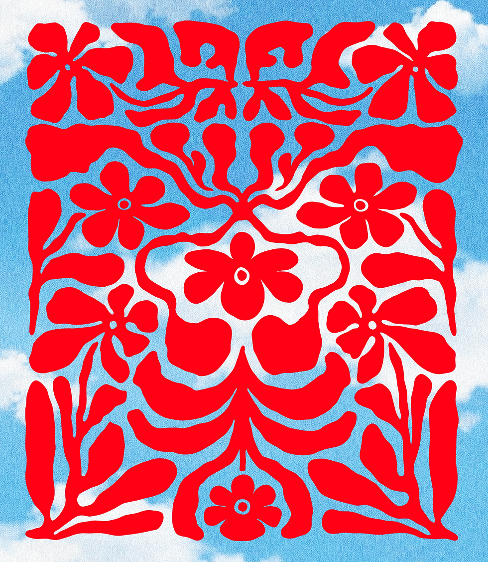
Taza is a seltzer brand developed in-house by a restaurant in India, created to complement its dining experience with something light, and full of flavor. The design direction aimed to mirror that intent, colorful, vibrant, and modern, yet with a sense of refinement that set it apart from typical packaged drinks. Using bold palettes, playful patterns, and clean typography, the identity was crafted to feel refreshing, approachable, and distinctly different, making Taza not just a drink but an extension of the restaurant’s personality.
Design Direction
PROJECT SCOPE
Packaging Design, Visual Identity
INDUSTRY
Food & Beverage
Creative work delivered independently in 2025.
Design Direction
Taza is a seltzer brand developed in-house by a restaurant in India, created to complement its dining experience with something light, and full of flavor. The design direction aimed to mirror that intent, colorful, vibrant, and modern, yet with a sense of refinement that set it apart from typical packaged drinks. Using bold palettes, playful patterns, and clean typography, the identity was crafted to feel refreshing, approachable, and distinctly different, making Taza not just a drink but an extension of the restaurant’s personality.
PROJECT SCOPE
Packaging Design, Visual identity
INDUSTRY
Food & Beverage
Creative work delivered independently
in 2025.
TAZA SELTZER
Blending bold colors and playful motifs into a drink identity with style.


Strategy & Insights
The strategy was to clean up the layouts while adding visual punch through vibrant, contrasting colors that instantly signal flavor and variety. A sharper hierarchy of information made it easier for shoppers to spot key claims, while bold photography brought indulgence to the forefront. Each product line was given its own distinct, flavor-led personality, yet unified under a cohesive system, ensuring Wholy stood out as both trustworthy and fun. By blending minimal structure with expressive details, the new design direction intended to be easier to navigate and visually tempting.