Context & Challenge
The ACE Project (Active Children Excel) is a nonprofit in Chicago creating safe spaces for Black and Brown youth to grow through tennis, mentorship, and education. Their work lives at the intersection of sport, empowerment,
and community.
While their mission was powerful, their visual identity lacked clarity and cohesion. The challenge was to design a brand system that felt joyful and grassroots—yet polished and credible enough to resonate with both children and donors.
The creative goal: a flexible and relatable identity that could define them and set them apart.
PROJECT SCOPE
Logo Design, Visual Identity, Social Media Design, Brand Collaterals.
INDUSTRY
Youth-Centered Nonprofit
Developed as part of my role at Modish Creative, in 2023.
Lead concept, design, and identity development.
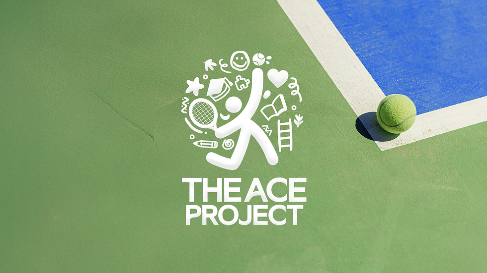
THE ACE PROJECT
Crafting a playful, purpose-first identity for a youth-centered nonprofit.
THE ACE PROJECT
Crafting a playful, purpose-first identity for a youth-centered nonprofit.
The ACE Project (Active Children Excel) is a nonprofit in Chicago creating safe spaces for Black and Brown youth to grow through tennis, mentorship, and education. Their work lives at the intersection of sport, empowerment, and community. While their mission was powerful, their visual identity lacked clarity and cohesion. The challenge was to design a brand system that felt joyful and grassroots—yet polished and credible enough to resonate with both children and donors.
Context & challenge
PROJECT SCOPE
Logo Design, Visual Identity, Social Media Design,
Brand Collaterals.
INDUSTRY
Youth Centered Non-Profit
Developed as part of my role at Modish Creative, in 2023.
Lead concept, design, and identity development.

Strategy & Insights
To start, I dug into their story—learning how tennis is used not just as a sport, but a vehicle for mentorship and confidence.I studied similar nonprofits and saw an opportunity to create something more balanced: vibrant but grounded, playful but professional.
The visual direction was shaped by three key ideas:
-
Bold simplicity
-
Approachability
-
Vibrancy in palette
Strategy & Insights
To start, I dug into their story—learning how tennis is used not just as a sport, but a vehicle for mentorship and confidence.I studied similar nonprofits and saw an opportunity to create something more balanced: vibrant but grounded, playful but professional.


ONLINE PRESENCE
Alongside the rebranding project, I led the redesign and management of ACE’s social media, focusing on building a cohesive, brand-led presence. Rolling out the new identity gradually, I created content that made their platforms more interactive and engaging. From bold colors to custom illustrations, the strategy included informative, shareable posts, student spotlights, and donation campaigns across Instagram and Facebook.
Over the course of three months, the refreshed content helped increase their organic engagement by 38% and contributed to a 22% boost in website traffic and donations.
ONLINE PRESENCE
Alongside the rebranding project, I led the redesign and management of ACE’s social media, focusing on building a cohesive, brand-led presence. Rolling out the new identity gradually, I created content that made their platforms more interactive and engaging. From bold colors to custom illustrations, the strategy included informative, shareable posts, student spotlights, and donation campaigns across Instagram and Facebook. Over the course of three months, the refreshed content helped increase their organic engagement by 38% and contributed to a 22% boost in website traffic and donations.