

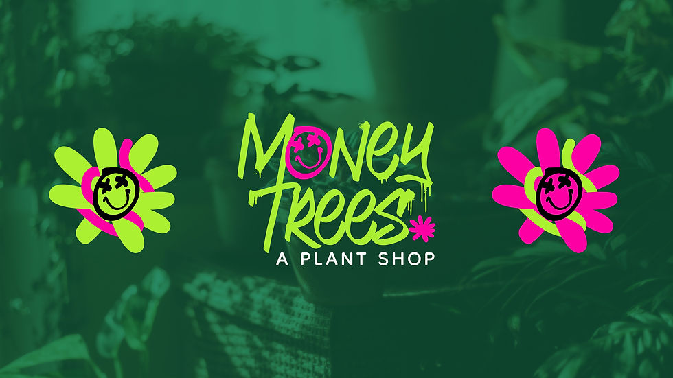
MONEY TREES
Blending urban culture and greenery into a one-of-a-kind brand.
Money Trees is a bold reimagining of what a plant shop can be, where urban edge meets botanical charm. With bold energy and a love for community, they set out to redefine what a modern plant shop is. The challenge was to create a visual identity that could carry this attitude, something modern, cheeky, and vibrant while still feeling like a credible, cohesive brand. The creative direction needed to feel fresh, energetic, and unmistakably urban, while still working across different brand touchpoints -from storefronts to social.
Context & challenge
PROJECT SCOPE
Logo Design, Visual Identity, Brand Collaterals.
INDUSTRY
Lifestyle & Wellness
Developed as part of my role at Modish Creative, in 2023.
Lead content strategy, design, and identity development.
Context & Challenge
Money Trees is a bold reimagining of what a plant shop can be, where urban edge meets botanical charm. With bold energy and a love for community,
they set out to redefine what a modern plant shop is.
The challenge was to create a visual identity that could carry this attitude, something modern, cheeky, and vibrant while still feeling like a credible, cohesive brand. The creative direction needed to feel fresh, energetic, and unmistakably urban, while still working across different brand touchpoints -from storefronts to social.
The creative goal: design an identity that turned heads and didn’t blend in with their competitors. A brand identity system full of contrast, edge, and attitude.
PROJECT SCOPE
Logo Design, Visual Identity,
Brand Collaterals.
INDUSTRY
Lifestyle & Wellness
Developed as part of my role at Modish Creative, in 2023.
Concept, design, and identity development by me.
MONEY TREES
Blending urban culture and greenery
into a one-of-a-kind brand.

Strategy & Insights
To shape the identity of Money Trees, I started by absorbing the essence of what made the brand tick, equal parts plant haven, urban cool, and cultural nod. The name itself, inspired by Kendrick Lamar’s “Money Trees,” hinted at a vibe that was rooted in grit and growth. That connect between nature and street culture drove the direction forward.
The visual direction was shaped by three key ideas:
-
Urban Energy
-
Organic Meets Abstract
-
Visual Rebellion
I wanted to represent this brand in a more expressive way, moving away from the clean, green, and sometimes too safe space. The visual language had to reflect that edge: graffiti-like textures, bold custom typography, and colors that felt electric. It wasn’t just about being quirky, it was about creating an identity that felt alive and unexpected.


From tote bags to signage, every item brought the brand’s high-energy personality to life. I used high-contrast colors, playful layouts, and loud typography to make sure even the smallest touchpoint felt true to the brand image.


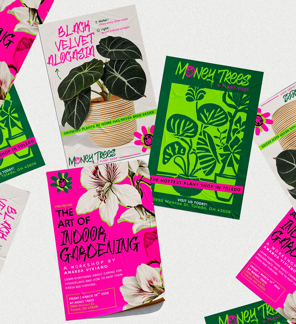

Styled to Stand Out
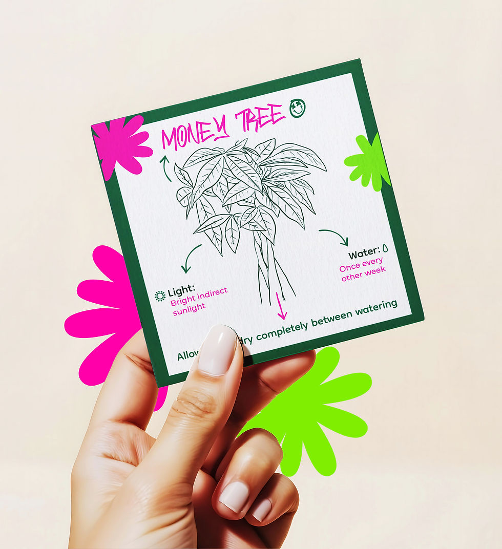
As part of their brand collateral, these plant cards were designed to bring more personality into everyday plant care. Each card features a hand-drawn illustration paired with easy-to-read care tips.
I intentionally avoided polished photography in favor of organic, loose illustrations that reflect the brand’s playful and bold spirit. Combined with vibrant colors and straightforward information, the cards are not just functional but they reinforce the brand’s image and give customers something memorable to take home.
STYLED TO STAND OUT
As part of their brand collateral, these plant cards were designed to bring more personality into everyday plant care. Each card features a hand-drawn illustration paired with easy-to-read care tips. I intentionally avoided polished photography in favor of organic, loose illustrations that reflect the brand’s playful and bold spirit. Combined with vibrant colors and straightforward information, the cards are not just functional but they reinforce the brand’s image and give customers something memorable to take home.


.png)


PLANTED WITH PERSONALITY
In a sea of earthy tones and minimal aesthetics, Money Trees launched with a look that was anything but ordinary and it worked. The brand identity embraced chaos, color, and creativity, building a shop that has more of a personality and
one that everyone would easily remember.